

A redesign by MPLS designer Luis Santiago.
the History
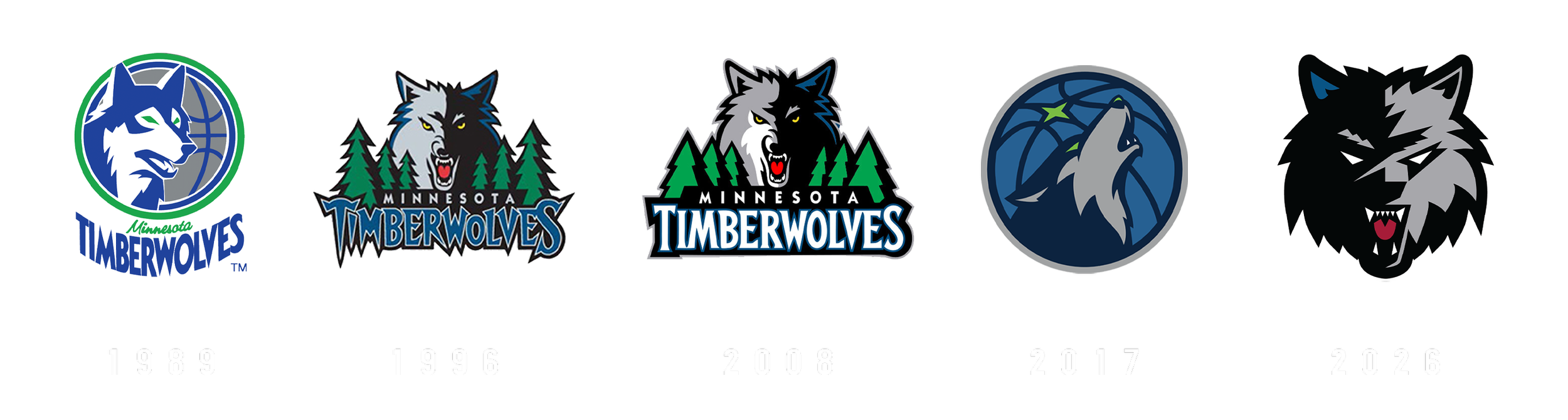
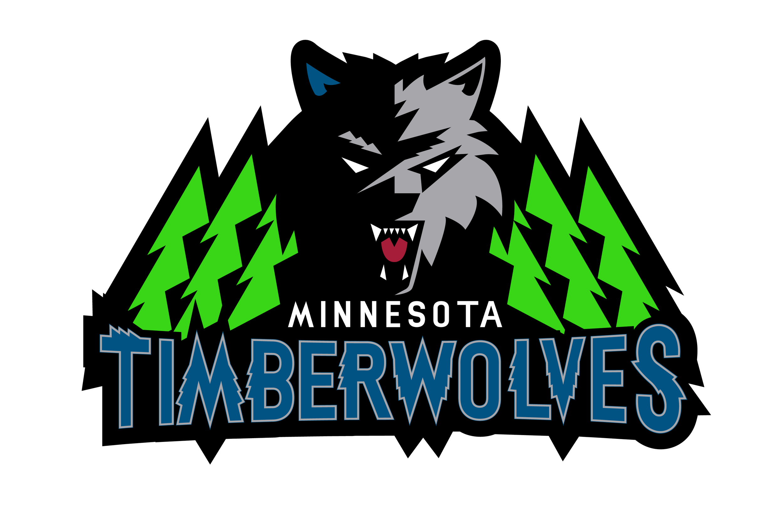
The Minnesota Timberwolves' visual identity has constantly evolved, shifting from the classic wolf profile of the early years to the aggressive, jagged-edged snarling wolf of the 90s, and finally to today’s sleek howling roundel beneath the North Star.
As we look to the future, the next evolution of the brand has the opportunity to seamlessly bridge these eras. A successful redesign can harness the raw, intimidating energy of the franchise's past while pushing toward a clean, bold aesthetic that ensures iconic heritage elements—like that precise, striking royal blue—resonate powerfully across modern merchandise and media for the next generation of fans.
THE EVOLUTION
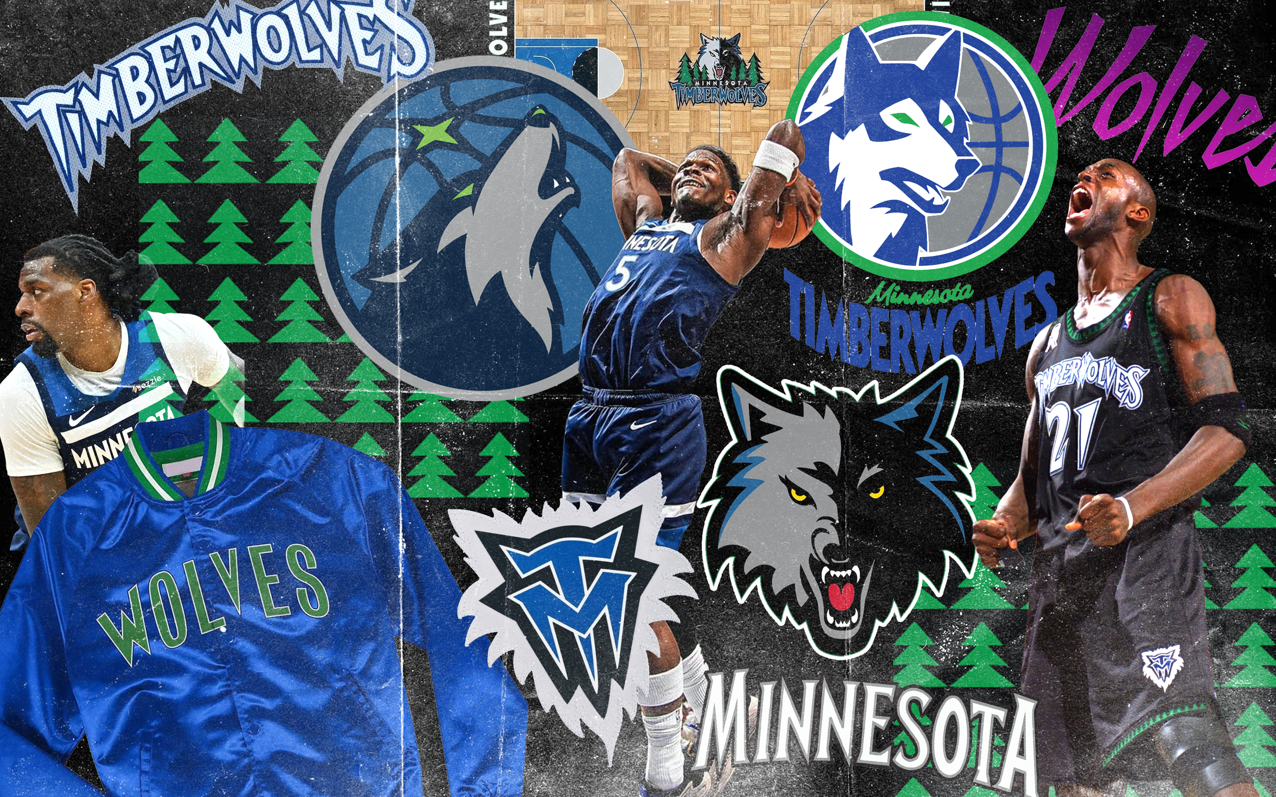
The Timberwolves' visual timeline is a fascinating study of balancing traditional sports aesthetics with raw energy. The 1989 original set the foundation with a simple, contained profile within a basketball.
The 1996 rebrand brought a radical shift to the iconic, aggressive snarling wolf emerging from the pines, which was then tightened and refined with bolder typography in 2008. By 2017, the identity pivoted back to a sleeker, minimalist roundel highlighting a howling wolf and the North Star.
The 2026 concept represents a bold new era—stripping away the borders, backgrounds, and text entirely to focus on a stark, high-contrast, front-facing wolf that brings back the fierce intimidation of the '90s but with a strikingly modern, streamlined execution.
THE WOLF

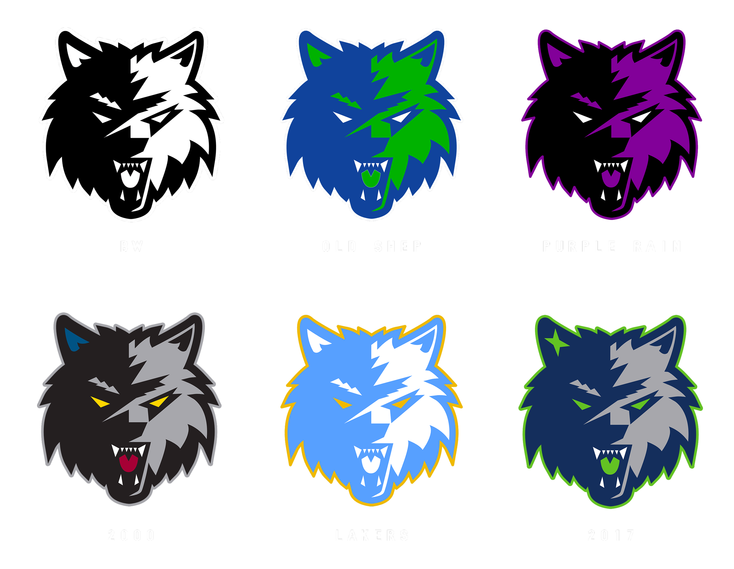
The redesign brilliantly blends nostalgia with modern branding by embedding the franchise's history directly into the mark's geometry. It channels the intimidating energy of the classic 1996 logo through the front-facing snarl, bared teeth, and a precise hit of heritage royal blue, while stripping away heavy backgrounds for a stark, high-contrast look.
Instead of a traditional forest backdrop, the sharp, jagged angles of the "New Tree" concept dictate the wolf's actual anatomy—these severe, geometric cuts define the fur's silhouette, the harsh shadow divide, and the aggressive brow, ultimately making the tree the structural DNA of the entire design.
THE LOCKUPS
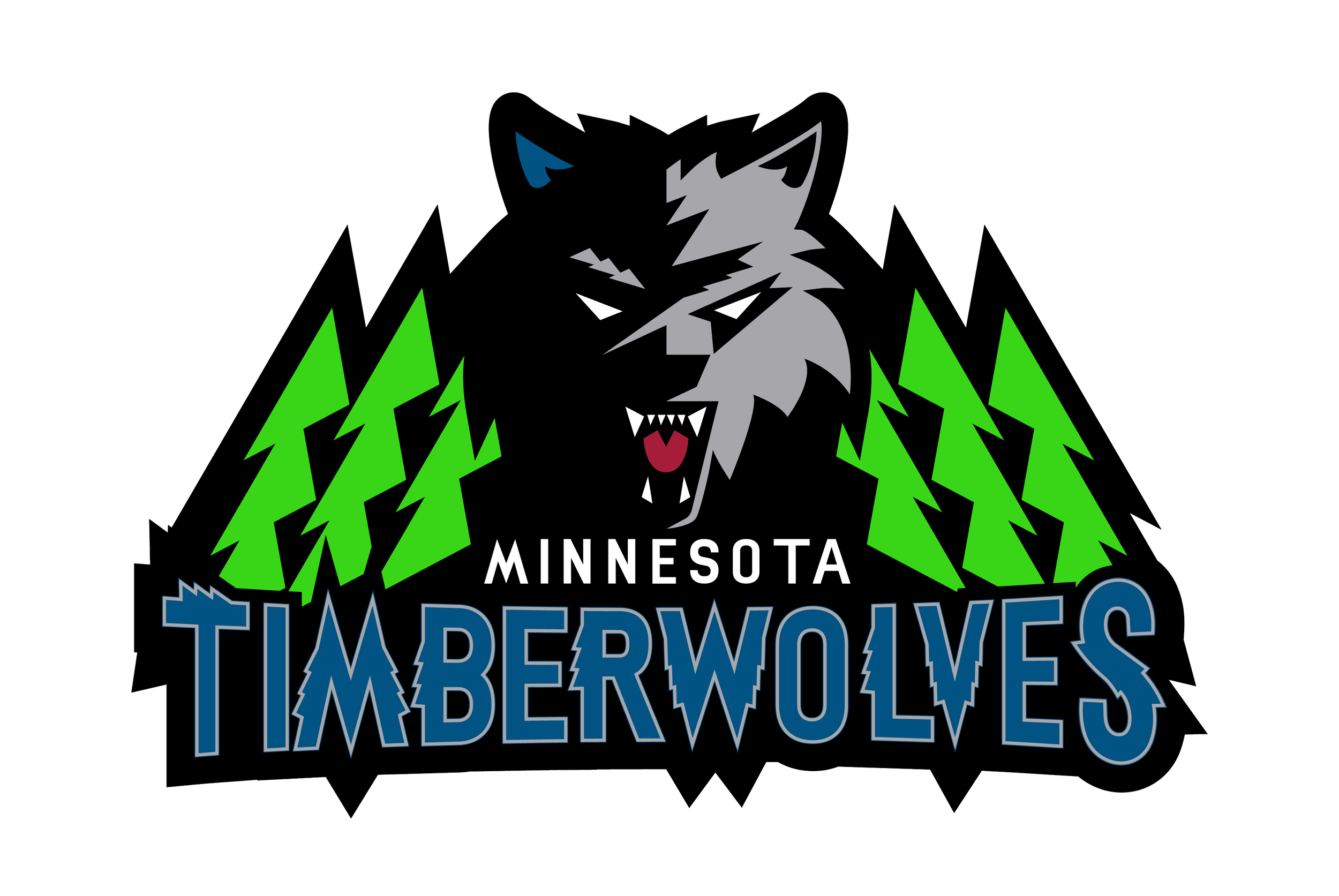
The redesign intentionally utilizes different logo lockups to create a fresh, edgy visual identity that masterfully pays homage to the beloved Kevin Garnett era of Timberwolves basketball. A full primary logo lockup prominently updates the standard configuration, positioning the aggressive, geometric wolf head over an abstracted, jagged green forest and Anchoring the entire mark with a bold wordmark reminiscent of standard 1996 design.
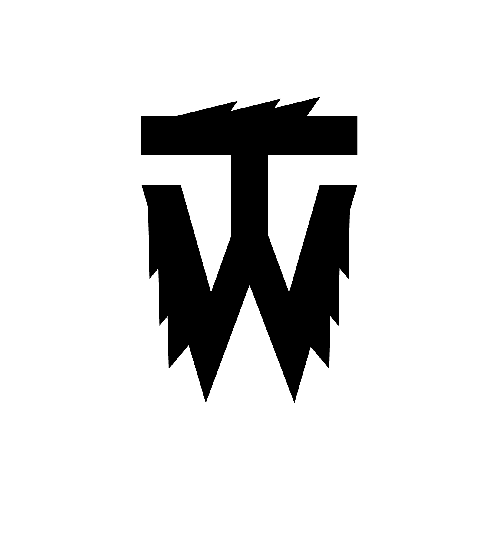
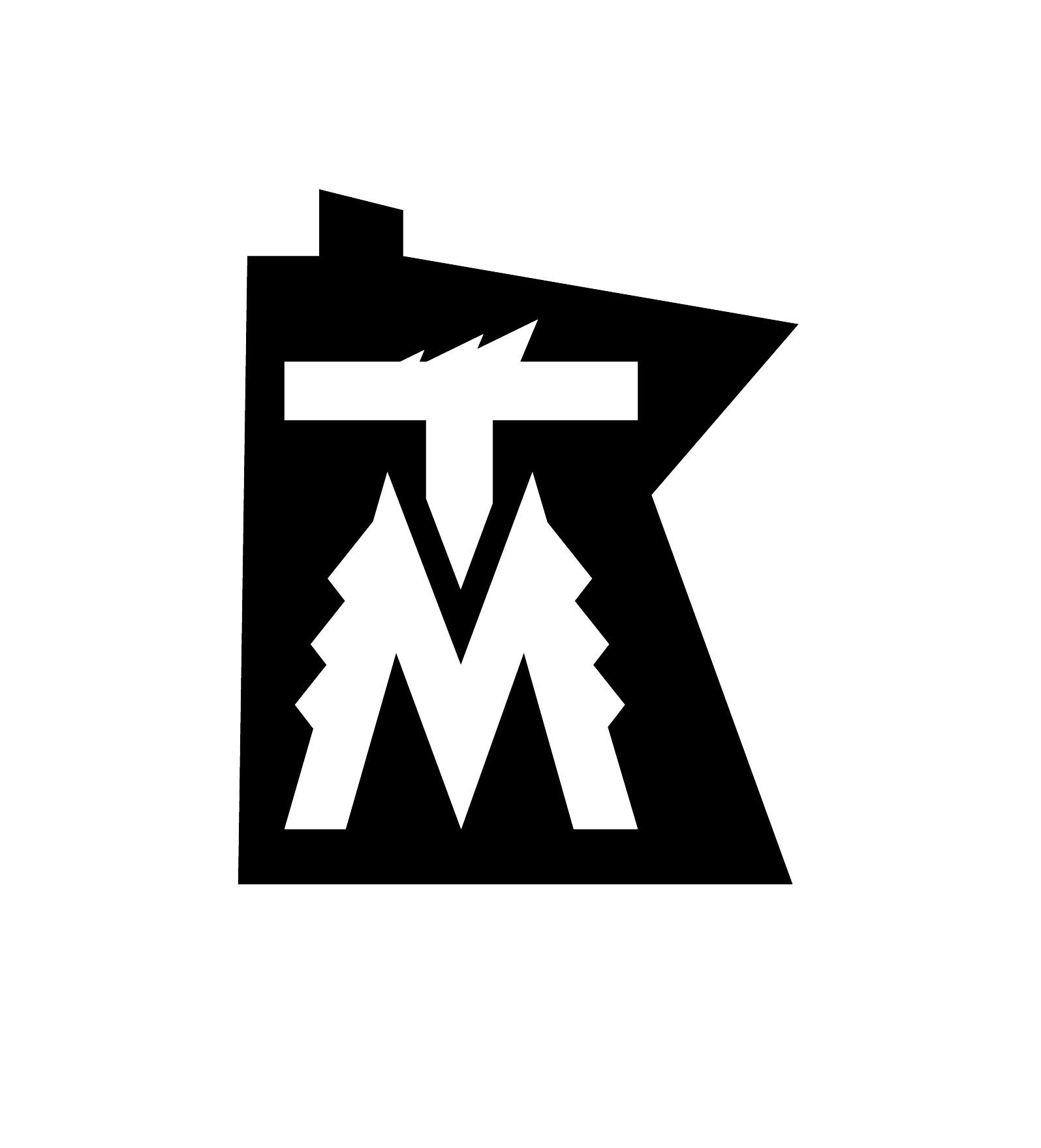
This full lockup is complemented by a series of flexible alternate applications designed for modern versatility, including clean, geometric monogram initial marks for subtle branding and a clean, arched wordmark that allows the redesigned wolf to connect with a wider range of contemporary applications, ultimately ensuring the raw energy of the past is captured in a way that is modern, flexible,and ready to resonate with the next generation of fans.

the FONt
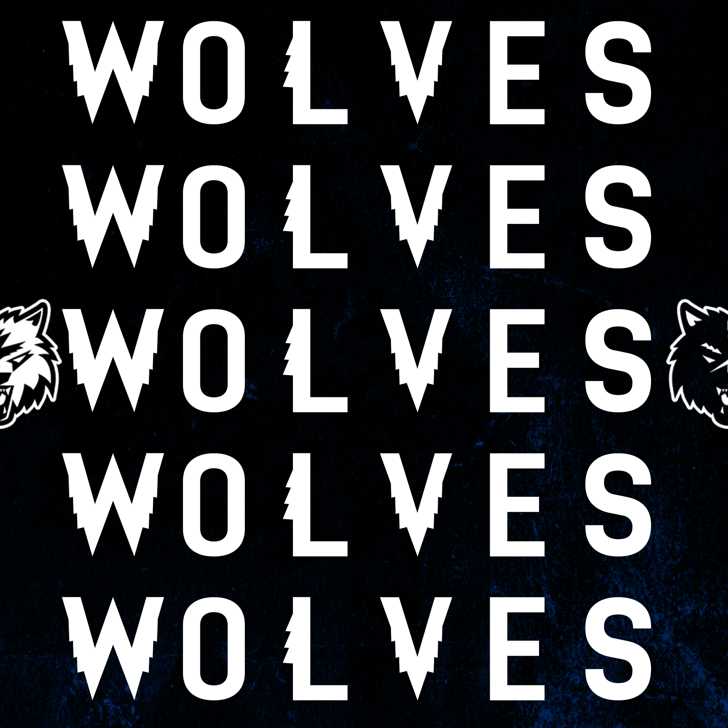
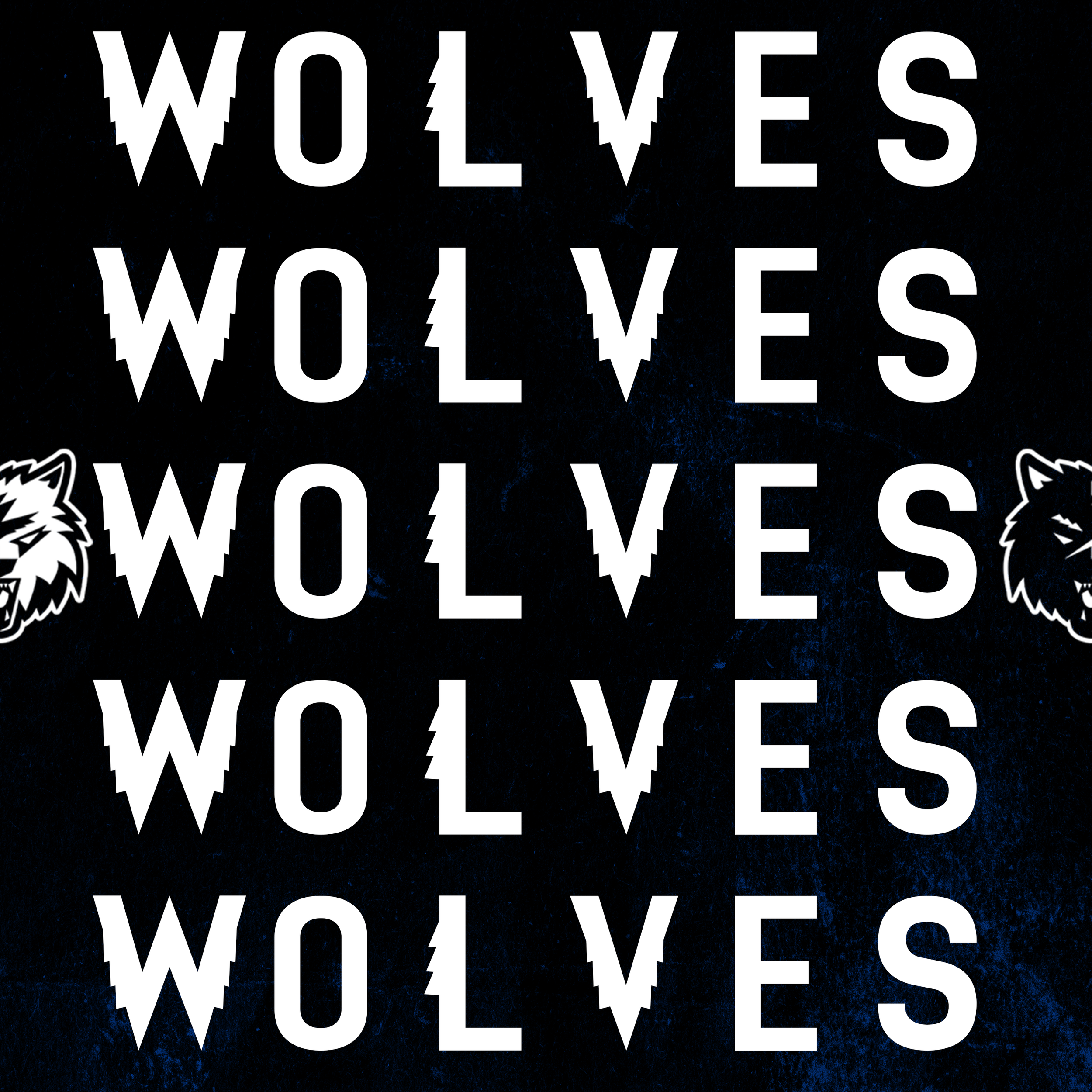
The redesign introduces a custom typeface that captures the rugged, undeniable spirit of the Minnesota Northwoods. Built on a foundation of clean, bold block letters, the typography intentionally features a slightly rough edge that grounds the brand in its natural environment.
To pay homage to the beloved pine trees that fans have long embraced, the font incorporates a unique, jagged "tree serif" detail on the vertical stems of the letters and numbers. This subtle yet sharp addition seamlessly ties the typography back to the franchise's heritage, ensuring every wordmark, logo lockup, and player number carries the raw energy of the wild.
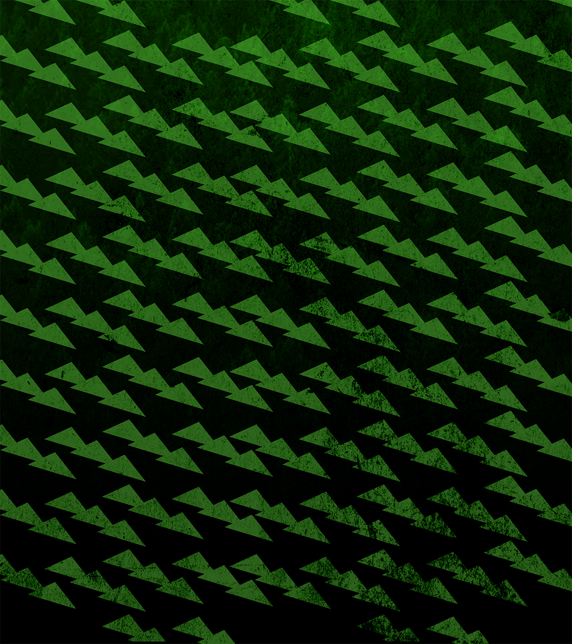
The redesign taps directly into the deep nostalgia of the classic tree border that Timberwolves fans have loved for decades, but reimagines it as a symbol of momentum and progression.
The new tree icon is explicitly engineered to represent moving fast and moving forward, stripping away the static repetition of the past in favor of a sleek, aerodynamic silhouette. Its forward-leaning, aggressive angles embody the true spirit of Minnesota—proving resilient, strong, and constantly building for the future.
By transforming a beloved heritage element into a dynamic, modern emblem, the design respects where the franchise has been while charting a bold, fast-paced trajectory for what lies ahead.
the NEW tREE
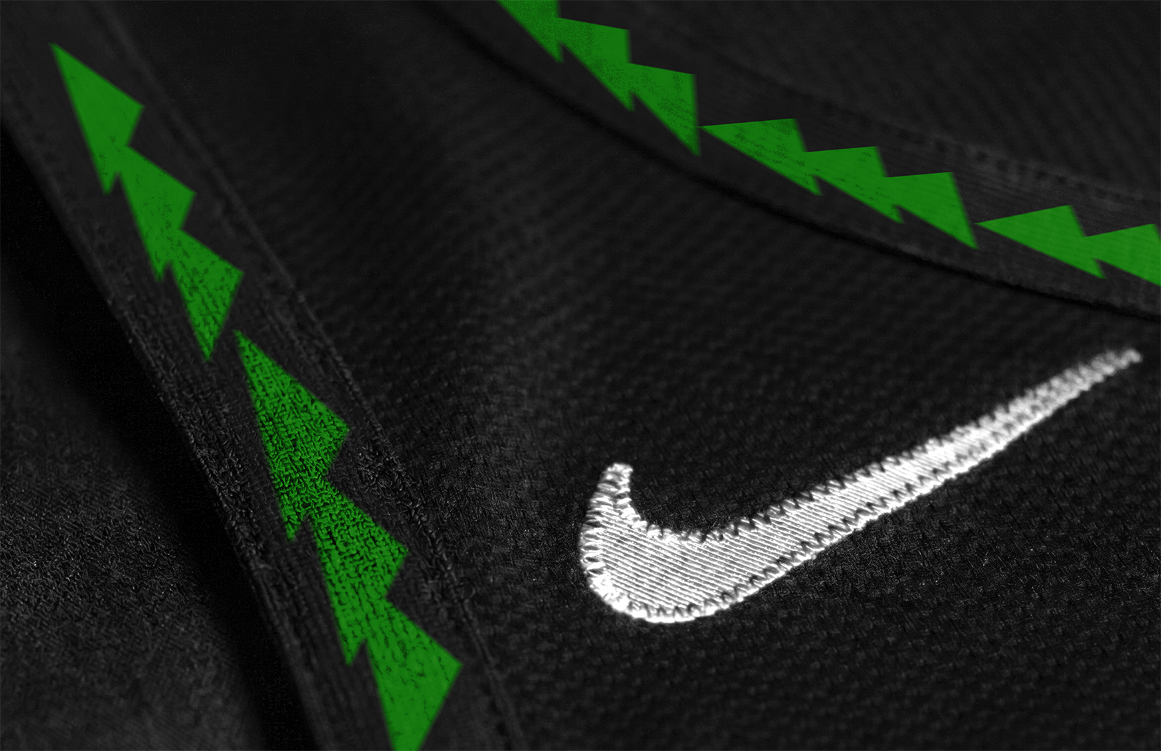
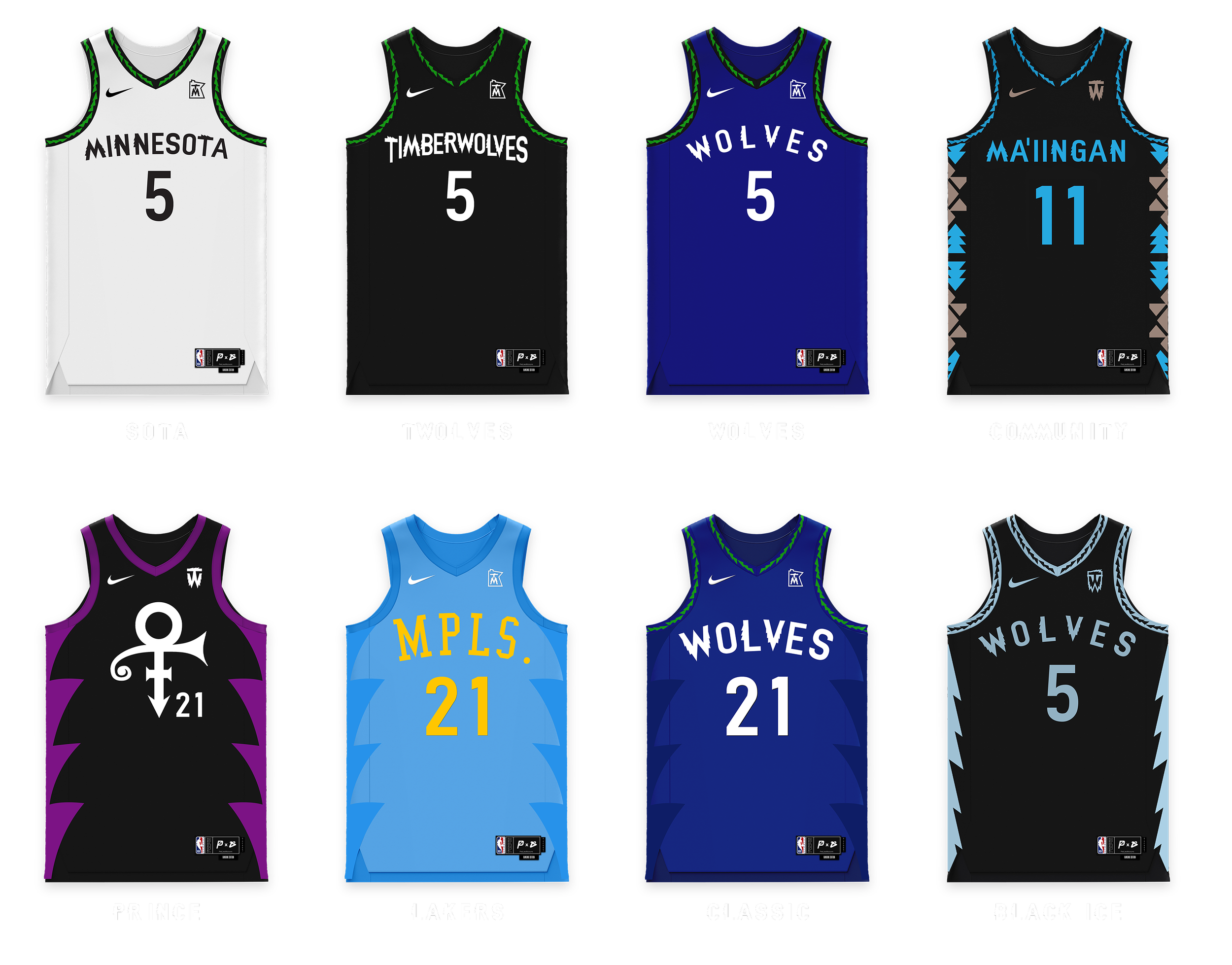
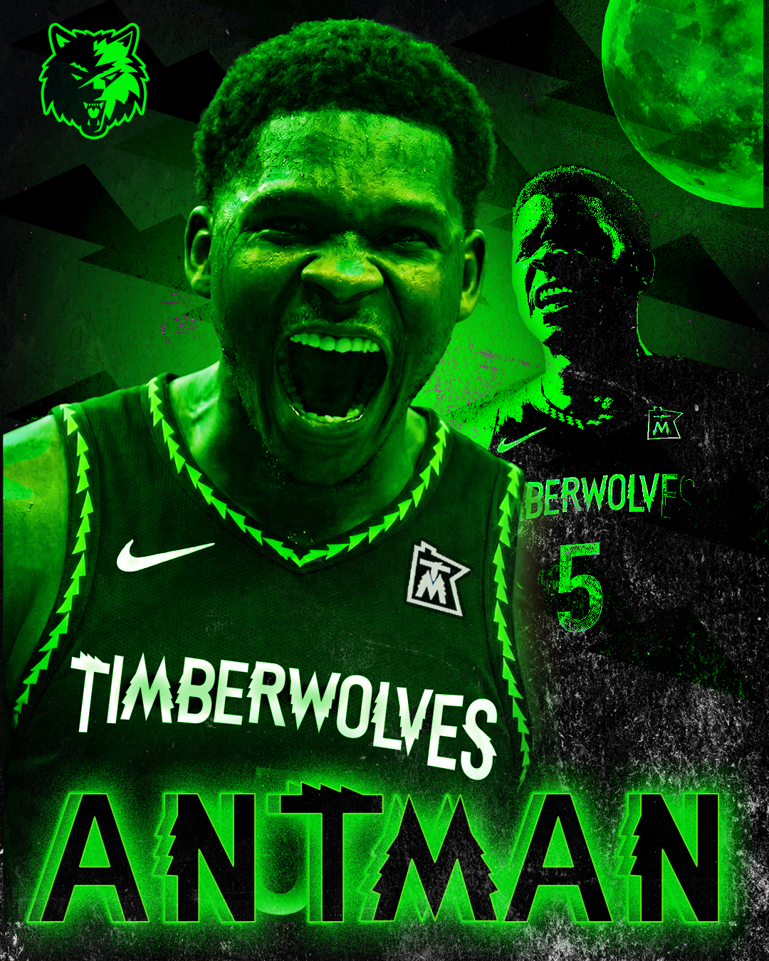
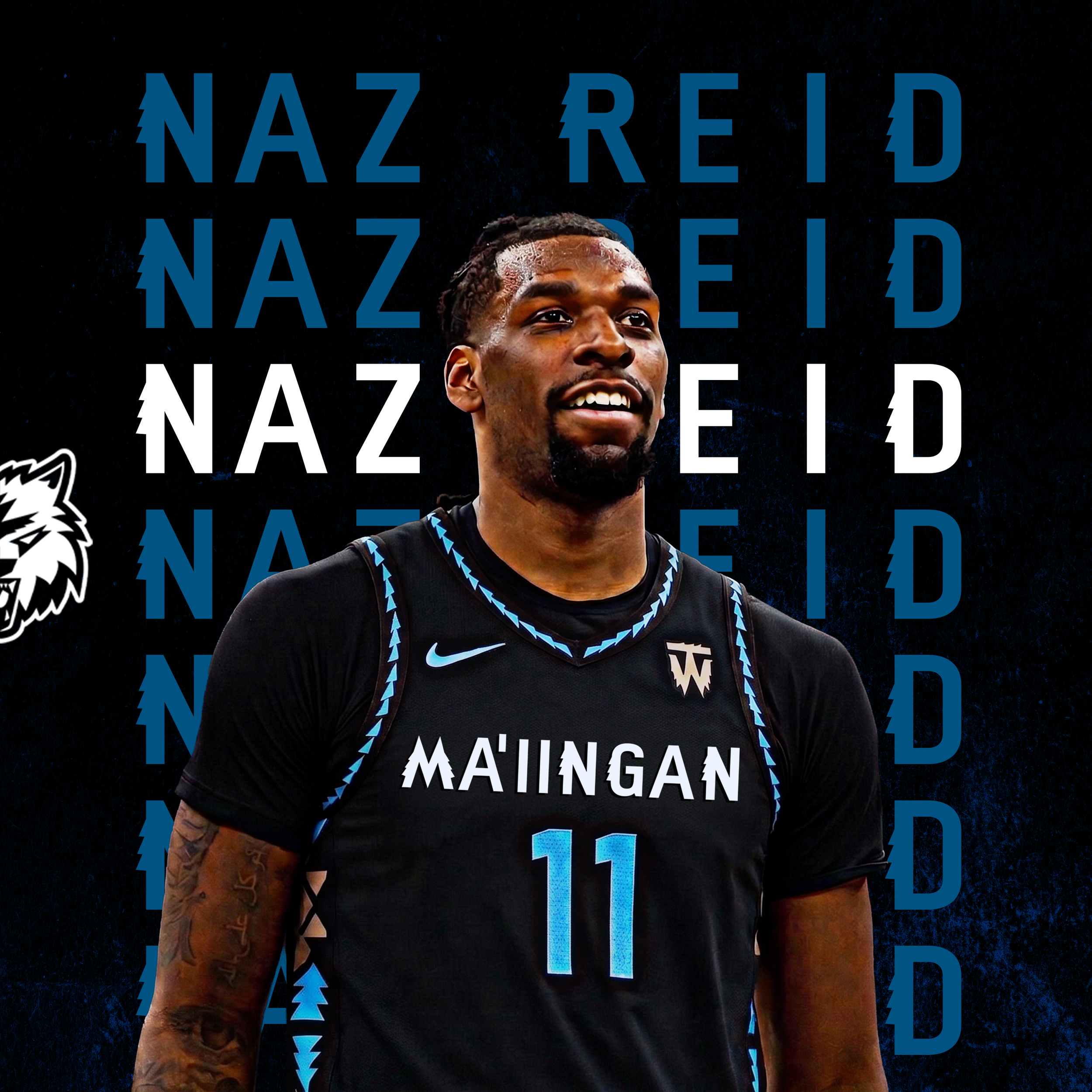
The redesign features an expansive eight-jersey lineup that deeply honors the franchise's multifaceted history, local culture, and enduring nostalgia.
The core SOTA, TWOLVES, and WOLVES uniforms establish a clean, modern foundation, anchored by the team's precise heritage royal blue and bordered by the dynamic "New Tree" motif along the trim. Expanding beyond the standard rotation, the collection pays profound respect to the region with a "MA'IINGAN" Community edition honoring indigenous heritage, alongside vibrant nods to the Minneapolis Lakers' foundational era and a striking black-and-purple tribute to Prince's iconic legacy.
Completing the set, the "Black Ice" edition perfectly captures the harsh, cold reality of Minnesota winters, while the Classic edition revives traditional aesthetics. Across the alternates, the geometric "New Tree" cutouts act as aggressive side paneling, seamlessly tying all eight distinct stories into one unified, forward-moving brand identity.
the Jerseys

thE COURt
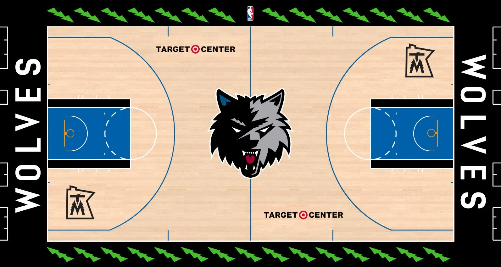
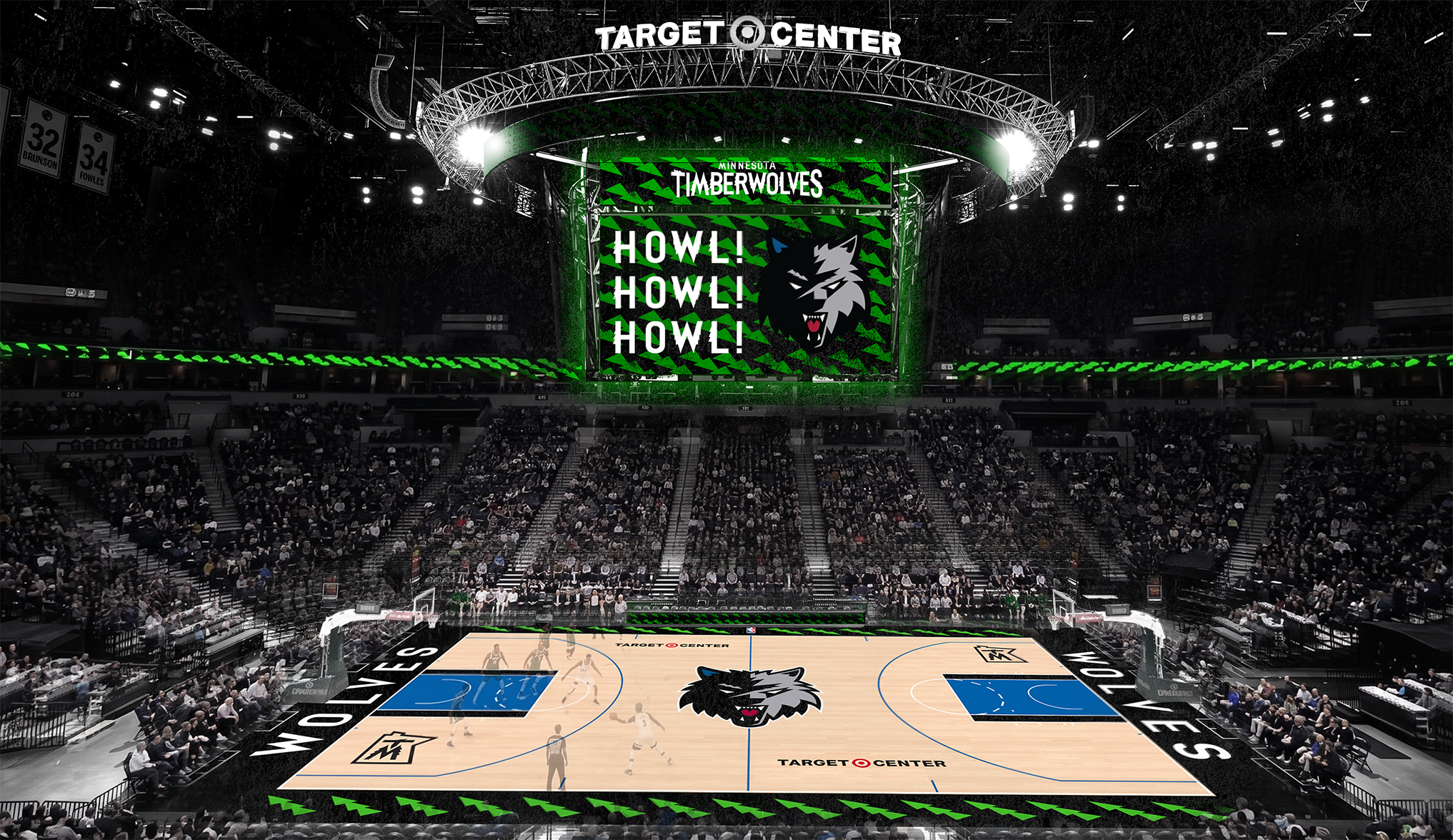
The redesigned Target Center court masterfully revives the layout of the beloved 1996 hardwood while infusing it with the brand's fast-paced, modern aesthetic. At center court, the stark, high-contrast wolf head commands attention, flanked by painted keys filled with that precise, signature heritage royal blue.
Along the sidelines, the classic pine border has been aggressively updated with the dynamic "New Tree" motif in vibrant green, framing the action with a distinct sense of forward momentum. The solid black baselines are heavily anchored by the bold, clean "WOLVES" typography set in the custom Northwoods font.
Rounding out the design, the secondary 'TM' state logo decals inside the three-point arcs are precisely positioned with their proper 90-degree clockwise rotation, ensuring every detail of this nostalgic yet futuristic arena is flawlessly executed.